FESTIVAL / EVENTS & IDENTITY
HORIZON.
One night. A shared energy.
HORIZON imagines a complete identity for a fictional night-time festival: programme, posters, environmental graphics, access passes, signage and a digital campaign.
 Photo: angpw napt / Unsplash ↗
Exploring a different visual language.
An event identity needs to bring emotion and information together. Here, one system runs from posters to passes and from the programme to the website, without suggesting that a festival has actually taken place.
Brand identity, editorial design, digital experiences and creative content.
Research, visual system, applications and presentation.
Personal exploration / no client commission.
A distinctive palette.
#0B1025#FF4D93#FF9B43#6E51D9Creating a feeling before telling a story.
HORIZON is conceived as a shared experience. The guiding image is a single form: a glowing disc on the horizon, between the end of the day and the beginning of the night.
Concert photography brings real documentary emotion, while the brand elements remain graphic and distilled. The photographs show other events and serve only as mood illustrations.
The photographed scenes do not depict a HORIZON event.
The symbol of a night beginning.
The main symbol combines a circle and horizontal lines, an abstract evocation of sunset. Widely spaced, almost technical capitals contrast with the softer light of the symbol.
The night-time palette of ink, purple, pink and orange maintains readability on dark surfaces. The logo can also work without a gradient in formal applications or single-colour documents.
Symbol and composition created as vector SVGs.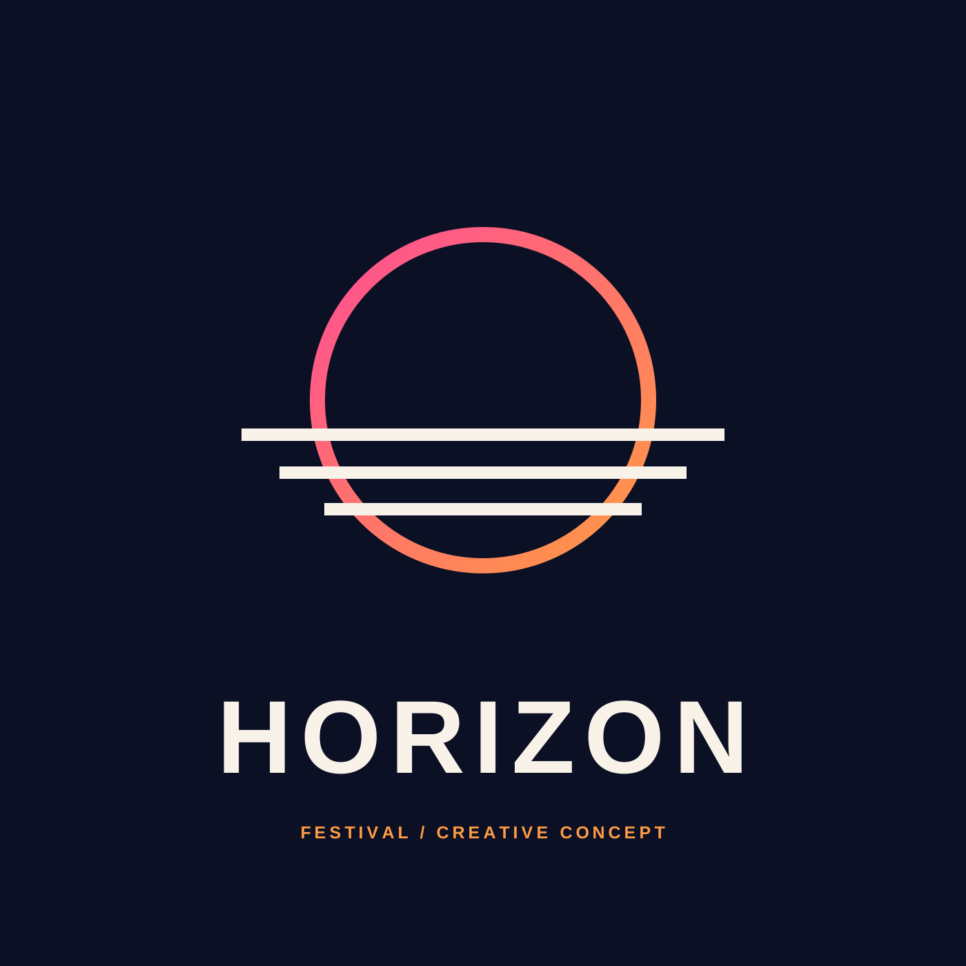
A poster that speaks from a distance.
The campaign uses a short, direct message: THE NIGHT IS OURS. The poster focuses on a single visual reference, a strong spatial identity and deliberately limited information.
No artist names, venue or dates are invented as though they were real event details. This poster is an example of art direction, not an actual announcement or ticketing material.
Concept poster, with no real artist line-up.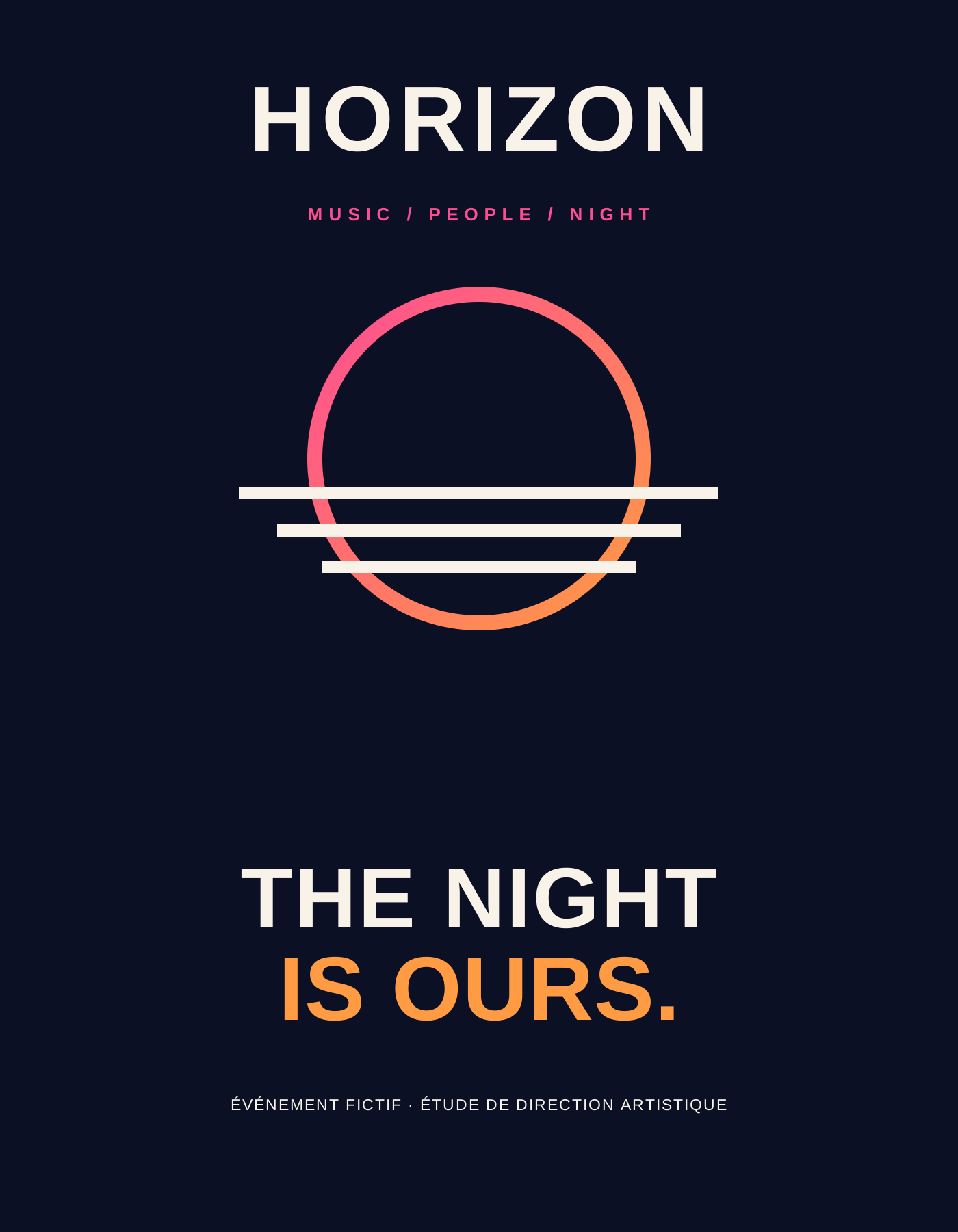
An identity that works on the ground.
A festival needs information that can be read quickly. The pass concept uses the brand palette while clearly distinguishing access categories and uses.
The badges shown here contain no real access codes. They explore the graphic organisation of signage and the visibility of essential information.
Fictional badge, not valid as accreditation.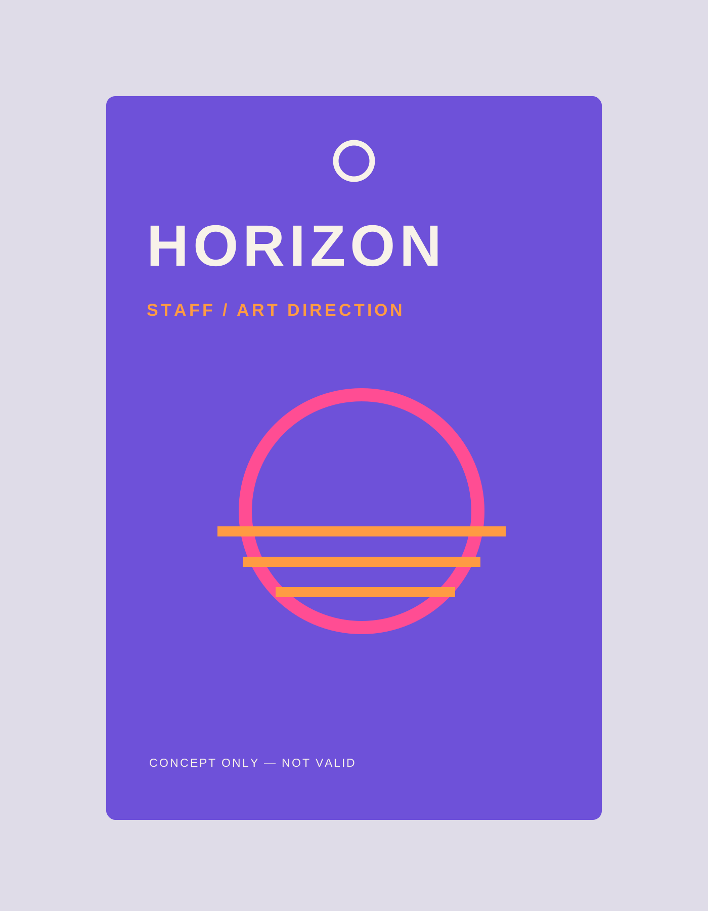
The programme at a glance.
The web page proposal offers navigation around useful information: programme, experience, access and contact. The identity should never slow the search for practical details.
A demonstration schedule was created to test the reading hierarchy; its times do not refer to any organised festival. Real ticketing and payments are outside the scope of this study.
HTML/CSS web mock-up and fictional programme.IS OURS.ONE NIGHT. MANY STORIES.
A rhythm designed for mobile.
Stories and posts turn the sun and horizon line into vertical compositions. Colour blocks in motion, dense typography and occasional photography build a recognisable visual language.
The system anticipates communication before, during and after an event, without inventing attendance figures, partners or a line-up.
Concept story, 1080 × 1920, adaptable without limit.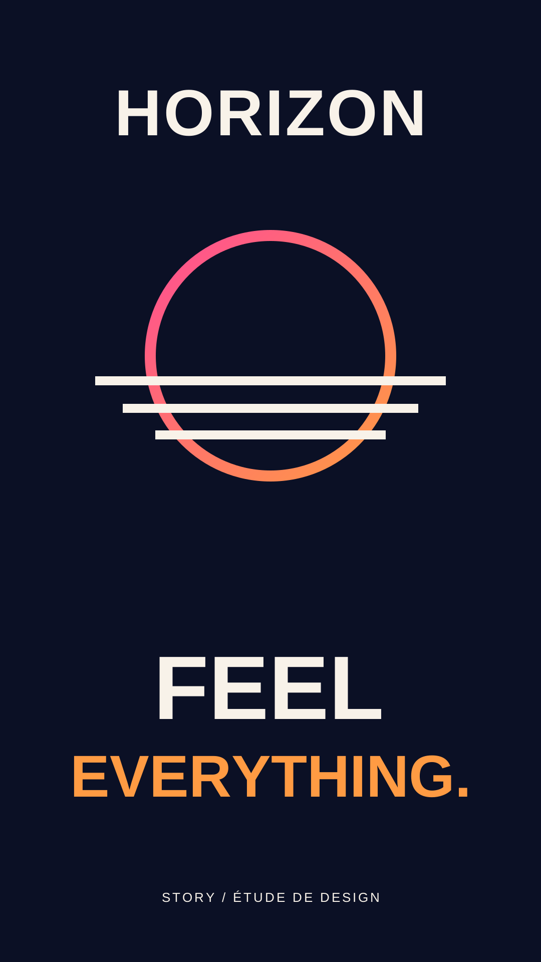
Materials designed together.
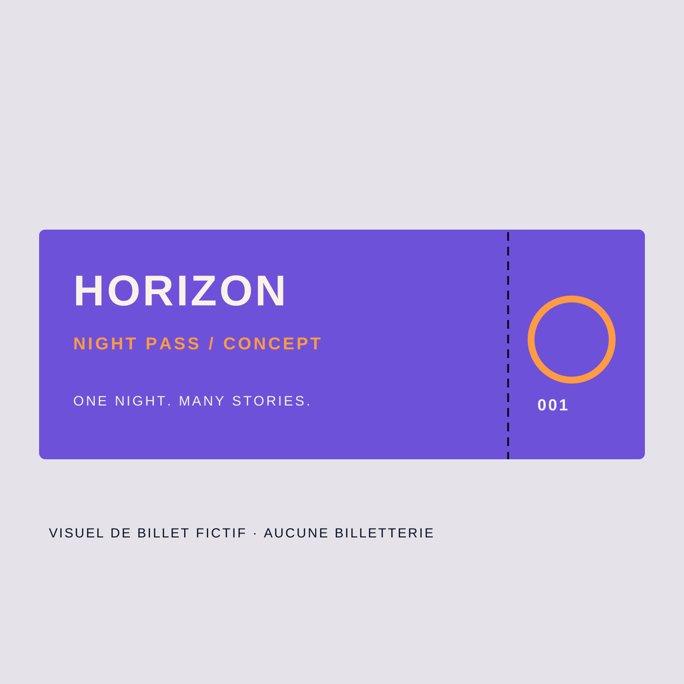
Concept ticket
A graphic ticket example without a validation code.
 Photo: Simon Kessler / Unsplash ↗
Performance & light
Real stage photograph used as a mood reference.
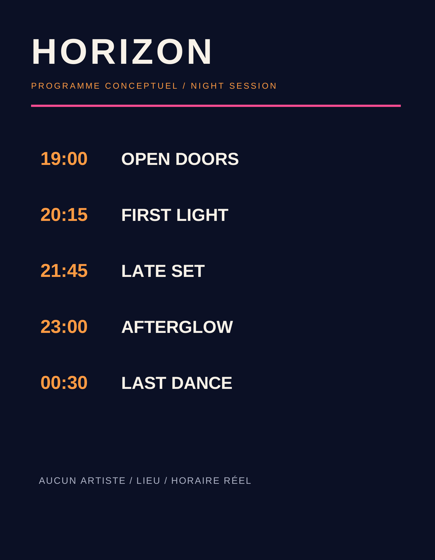
Programme grid
A layout study with fictional times.
Another way to create.
An event identity needs to bring emotion and information together. Here, one system runs from posters to passes and from the programme to the website, without suggesting that a festival has actually taken place.