An adaptable identity
A name, wordmark and geometric mark brought together in a system for print and digital applications.
Publishing · Science & culture
ORBITE is a concept for a science and culture publishing house. The starting point is to make people want to open a book before they even know its subject. A vivid identity, a numbered series and graphic compositions make big questions approachable without flattening the ideas behind them.
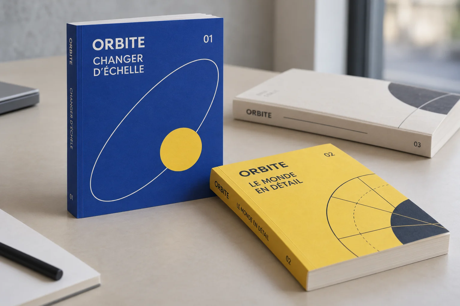
Brand identity in context · AI-generated imagery.
Identity and applications created for this exploration, without a client commission. Staged imagery is generated with AI.
The brief / ORBITE
Imagine the identity and first applications for a fictional independent publishing house. ORBITE speaks to curious readers who encounter science through ideas, images and stories. The system needs to work on books, notebooks, posters and screens, with a consistent character that leaves each subject room to develop.
Avoid both classroom conventions and spectacular science imagery. The challenge is to build a thoughtful but welcoming world that can bring very different subjects together. Each title needs its own presence, while the series remains recognisable at a glance, even when a cover appears as a small digital thumbnail.
The name suggests a change of viewpoint. Orbital curves, shifts in scale and oversized numbers express this without literal illustrations. Blue provides structure, yellow draws attention and cream evokes paper. A precise grid holds the compositions together while allowing titles and graphic elements to take different positions within it.
#2348B5#F0CF47#F4F0E5#202733This exploration brings together editorial positioning, visual identity, series architecture and communication design. The titles, covers and applications were developed for the study. AI-generated photographic scenes help examine the system across objects and settings; they do not depict a real publishing business or books that are commercially available.
01 / ORBITE
A compact wordmark gives the name weight. Alongside it, the orbital mark introduces a lighter movement: it can act as a reference point, a window or a detail within a composition. This contrast between dense type and fine line gives ORBITE a distinctive expression across different fields of knowledge.
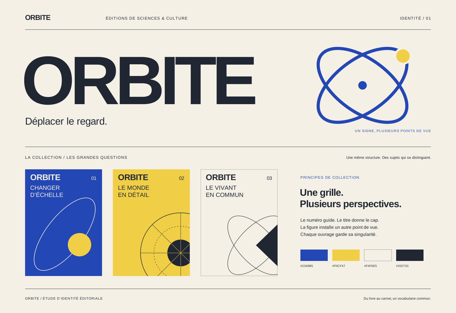
Wordmark, orbital mark and composition principles.
02 / ORBITE
The number, title and graphic figure occupy consistent positions. Colours and shapes change with the subject. Changer d’échelle, Le monde en détail and Le vivant en commun offer three distinct ways into the series, using different covers with a shared hierarchy and spines that are easy to identify on a shelf.
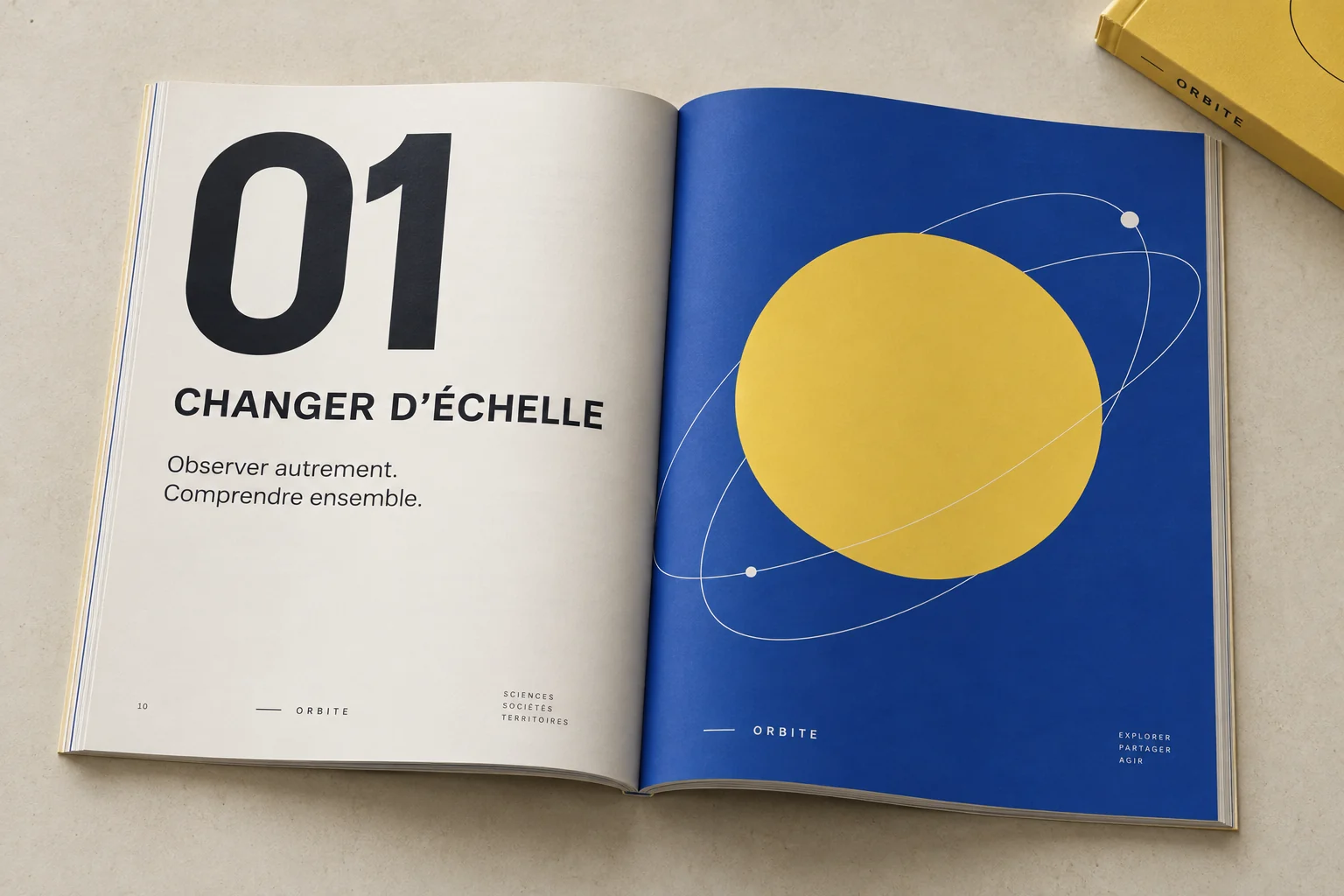
Cover designs, numbering and series architecture. · Brand identity in context · AI-generated imagery.
03 / ORBITE
The launch poster gives the book’s title a much larger scale, then provides a second layer of reading to introduce the subject. The same proportions extend into digital visuals. Formats change, but the series’ reference points stay clear and familiar, without adding visual elements that distract from the content.
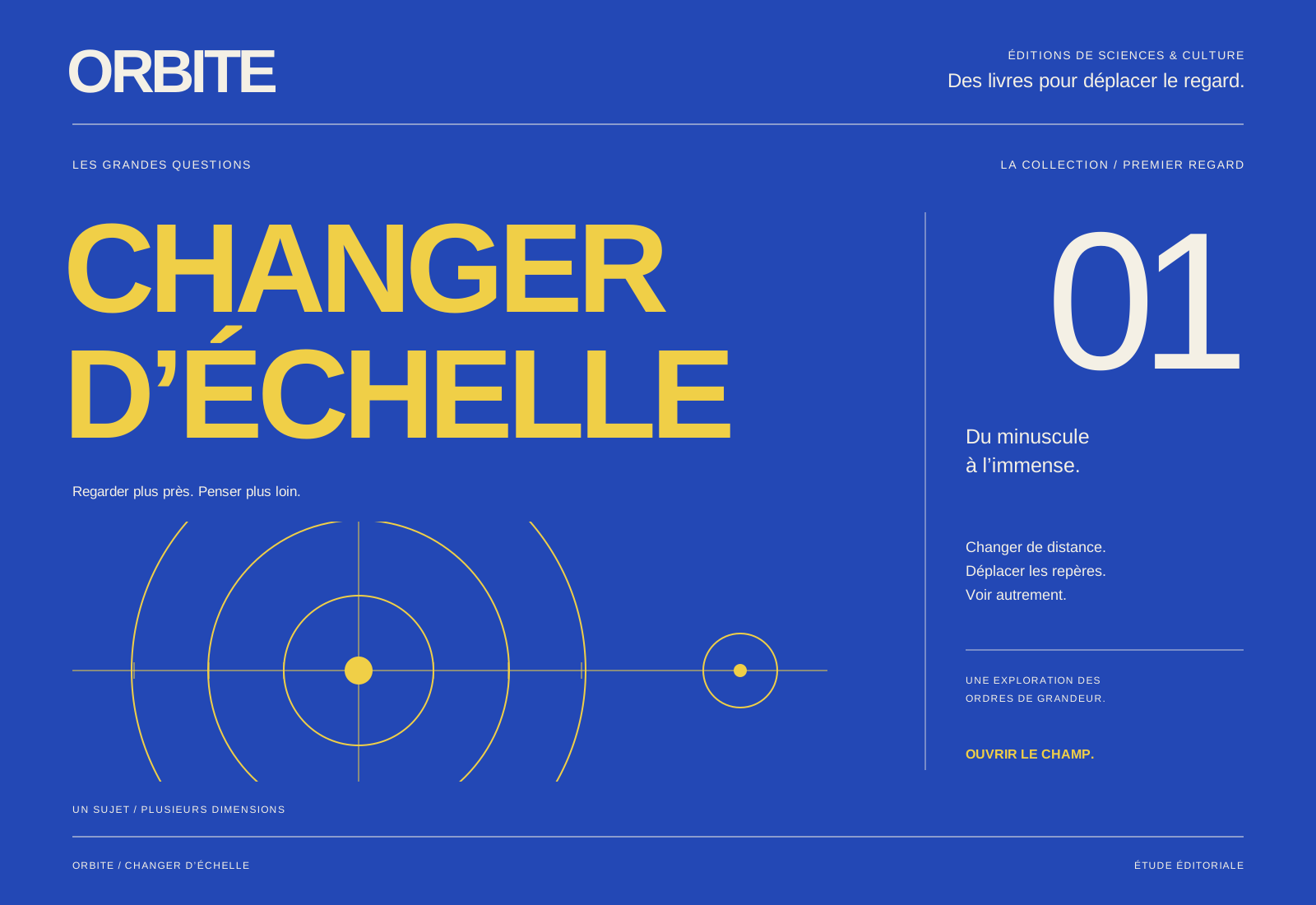
Editorial poster and digital formats.
Design intentions and study deliverables, without measured commercial results.
A name, wordmark and geometric mark brought together in a system for print and digital applications.
Rules for titles, numbering and composition help each book stand apart while clearly belonging to the same publishing house.
A poster and product scenes that prioritise the subject, the title and the publication itself.
ALTO27 / ORBITE