A readily recognisable brand
An original geometric symbol, a readable name and a focused palette create an identity that works for business communications and practical working documents alike.
Construction & renovation
STRATE is a brand study for a fictional construction and renovation business. Its starting point is the precision of a building site, translated into a clear, practical identity that can work across different formats. From the symbol to project documents, each application follows the same principles of levels, connections and wayfinding.
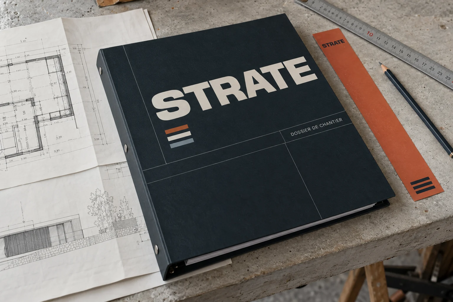
Brand identity in context · AI-generated imagery.
Identity and applications created for this exploration, without a client commission. Staged imagery is generated with AI.
The brief / STRATE
Create an identity for a business that builds and renovates, speaking to homeowners, architects and site partners with different needs. The brand should establish trust at the first conversation, then remain useful in more technical settings, including preparation documents, project files and simple signs that help people find their way.
Construction already has a familiar visual vocabulary: tool icons, building silhouettes and safety colours. The challenge was to give STRATE an expression of its own, distinctive enough for a business presentation and restrained enough for working documents where information needs to be read quickly and accurately.
We built the system around three horizontal levels that widen towards the base. The symbol suggests support, connection and the gradual development of a structure. Direct typography, consistent margins and numbered references organise the information. Oxide orange highlights entry points, while blueprint blue gives technical annotations a distinct place within the layout.
#19262E#E6E2D9#BE5A36#447A95For this study, ALTO27 developed the positioning, art direction and document structure. The work explores how to present a business, establish an information hierarchy and prepare a consistent system for the people who might use it. The documents and visual settings show how the proposed brand could be applied in practice.
01 / STRATE
Three layers form a progressively wider base. The simple geometry keeps the mark recognisable at a small scale, on a cover or in the corner of a document. The name takes the lead, supported by a short descriptor that makes the business clear: construction and renovation.
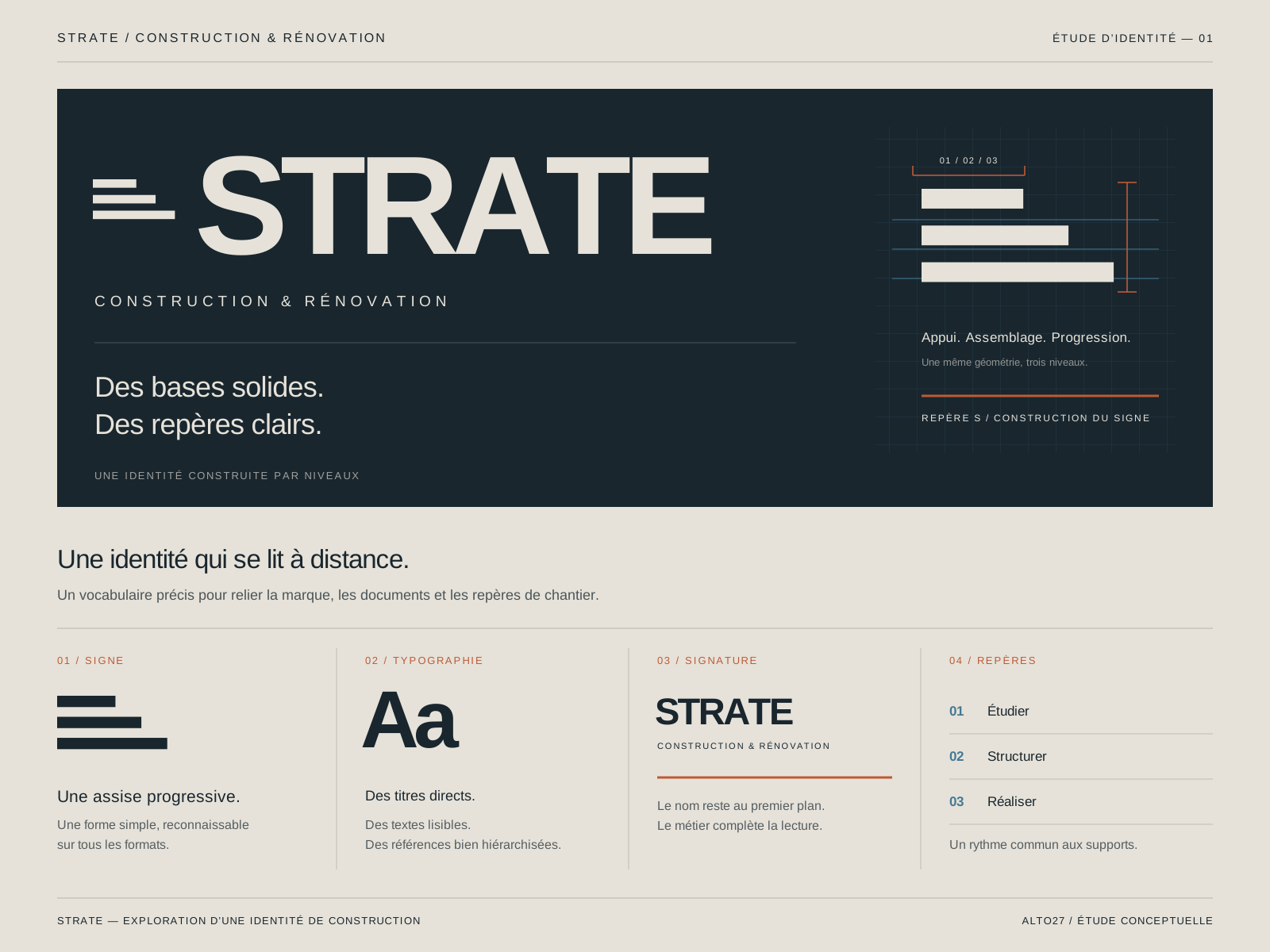
Original symbol, composition and reading principles.
02 / STRATE
Covers and progress sheets share the same structure: document title, relevant area, reference and useful details. Numbers act as visual entry points. This framework gives discussions, approvals and preparation a clear place, while leaving enough space for the content that people need to read and use.
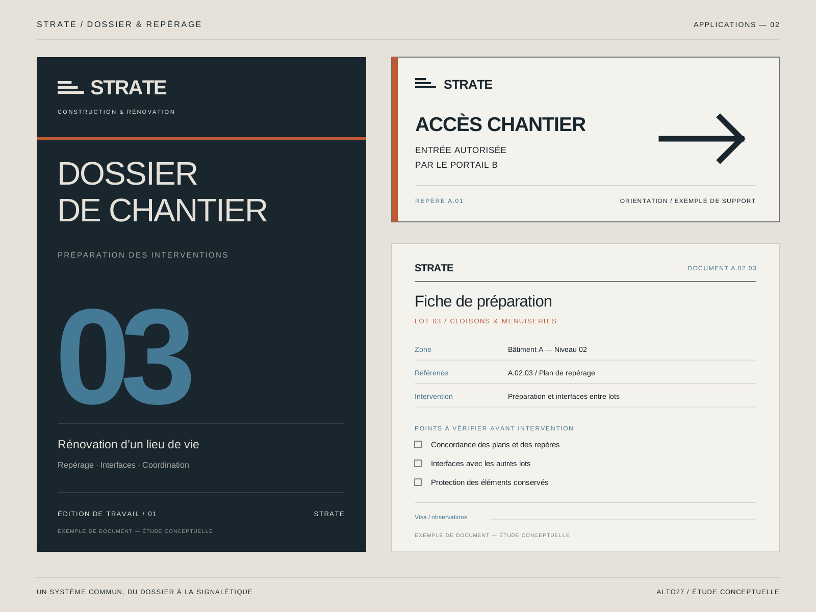
Project file and example progress sheet.
03 / STRATE
The graphic language extends to access and circulation signs. Strong contrast, short instructions and a generously sized arrow put legibility first. The same levels and alignments connect these applications to the wider identity, while leaving enough room for information that will vary from one location to another.
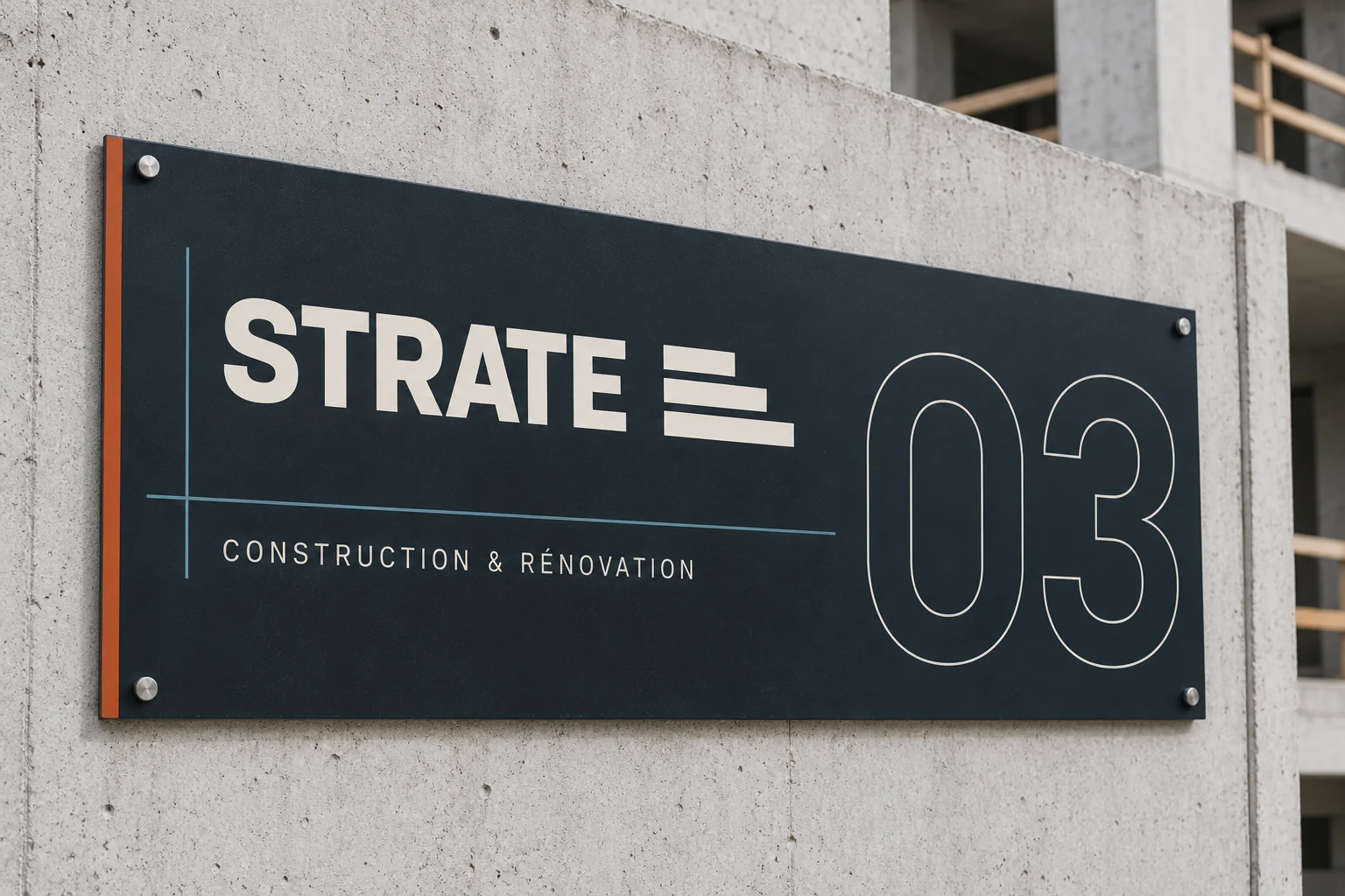
Wayfinding concepts to adapt to each location. · Brand identity in context · AI-generated imagery.
Design intentions and study deliverables, without measured commercial results.
An original geometric symbol, a readable name and a focused palette create an identity that works for business communications and practical working documents alike.
A shared structure connects project files, forms and reference points. Titles, areas and document references have a consistent position across the layouts.
The study brings the identity, project file and wayfinding together, with reusable layout principles that can be clearly explained and handed over.
ALTO27 / STRATE