Brand system
A name, wordmark, symbol and four colours brought together in a consistent identity.
Skincare & everyday living
SÈVE explores the identity of an imagined botanical skincare brand built around everyday rituals. The study connects naming, graphic design, packaging and product pages. Its visual direction is gentle yet distinctive, giving materials, typography and the quality of information as much attention as the imagery itself.
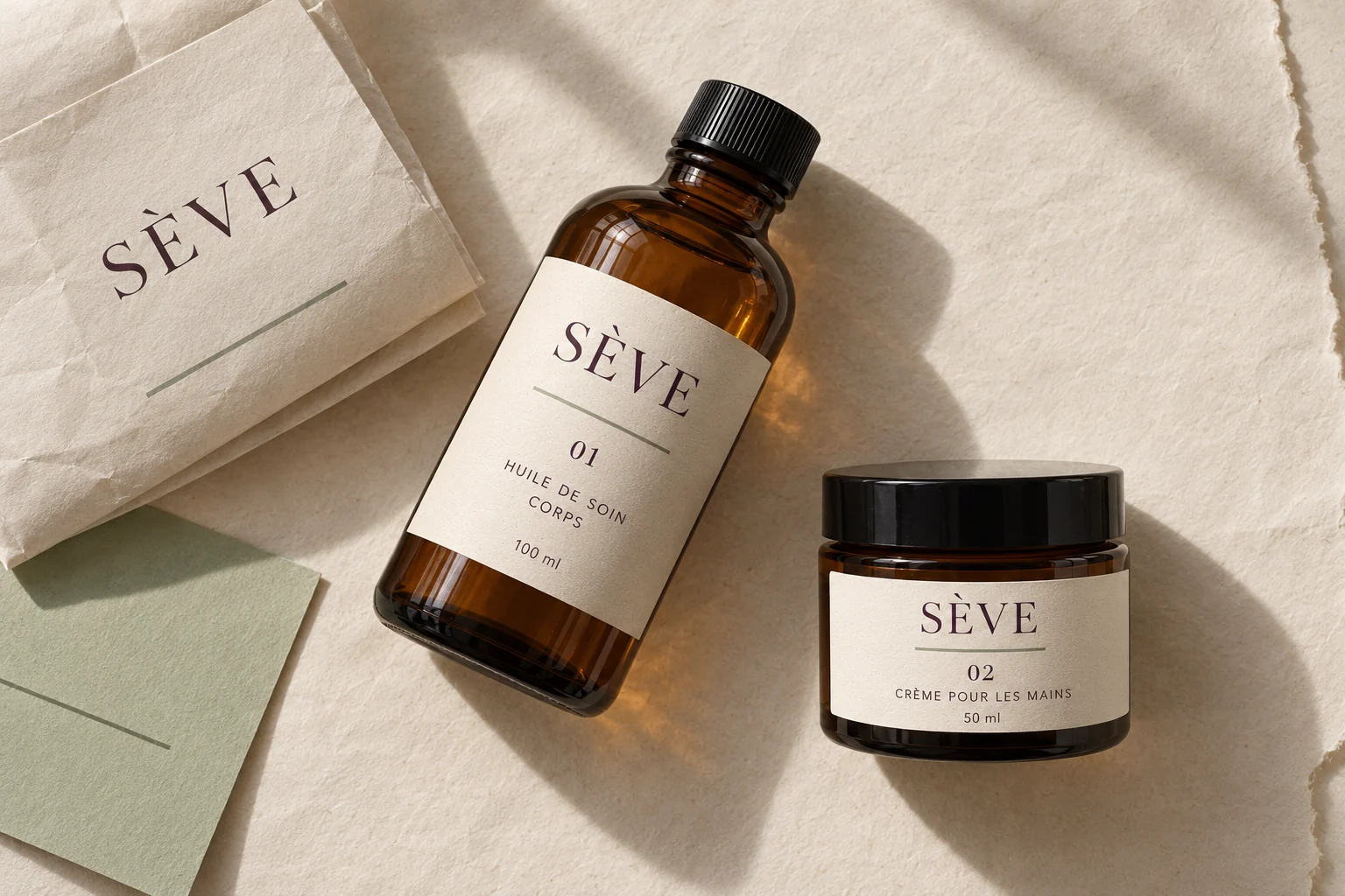
Brand identity in context · AI-generated imagery.
Identity and applications created for this exploration, without a client commission. Staged imagery is generated with AI.
The brief / SÈVE
Create a skincare brand that feels instantly recognisable on a small bottle, a jar and a screen. The brief calls for warmth and clear communication: make the product type, intended use and size easy to understand, without relying on elaborate visual effects or a long list of promises.
Skincare brands often use a familiar visual vocabulary: soft greens, leaves and lengthy descriptions. The challenge was to build a distinctive personality while keeping practical information prominent. The same clarity also needed to work on a narrow label and a more detailed product page.
Deep aubergine brings an unexpected tone to the botanical category, balanced by sage and warm paper. The SÈVE wordmark sits within a generous composition, accompanied by a simple organic symbol. A consistent grid then structures the range around four essentials: number, product name, use and size.
#382D3B#B8C5AA#F3EFE6#C7AEB7A fictional brand study developed by ALTO27, covering the creative brief, art direction, visual applications and content structure. The photographs were generated with AI to explore this direction. No products are sold; formulation, regulatory labelling and manufacturing are outside the scope of this study.
01 / SÈVE
Expressive typography and a restrained layout give SÈVE a quiet presence. The symbol suggests growth without depicting a particular plant. It can stand alone at a small scale, while the name remains the primary point of recognition wherever the format allows more space.
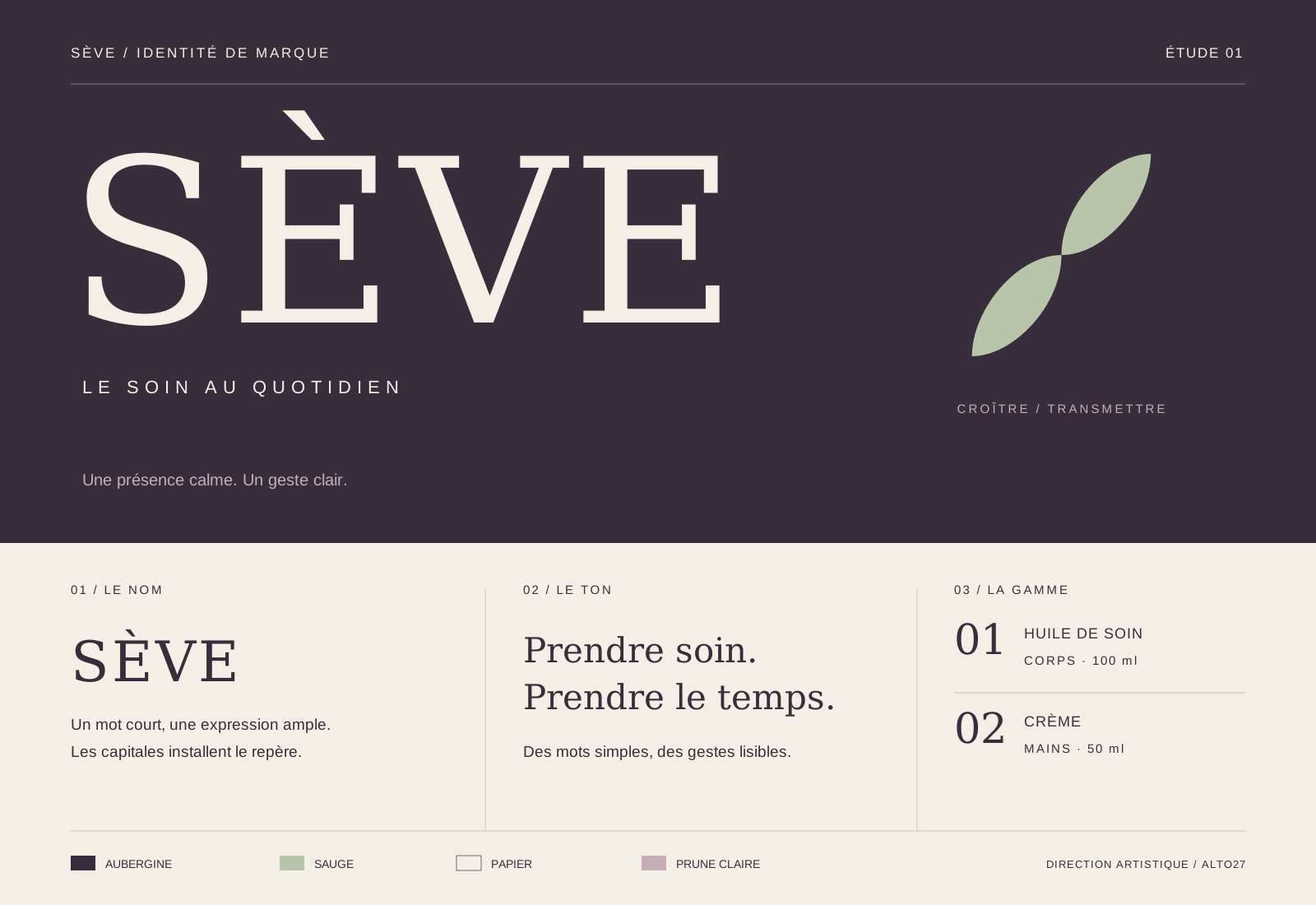
The symbol supports the name rather than replacing it.
02 / SÈVE
The range number, product name and intended use occupy consistent positions. The size remains visible at the bottom of the label. This structure distinguishes an oil from a cream without redesigning every package. More detailed information has its own space, set in type suited to the reading distance.
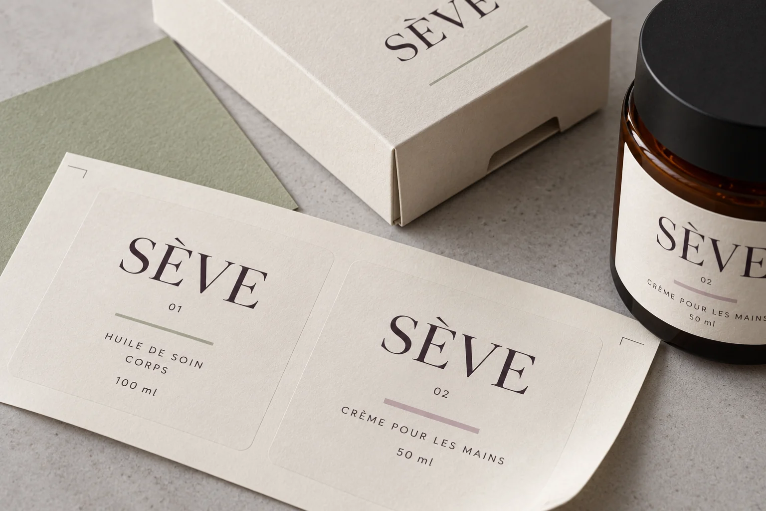
One hierarchy, two different formats. · Brand identity in context · AI-generated imagery.
03 / SÈVE
The product page extends the language of the label: a clear name, a short description and practical details about format and use. The image sets a mood, then the copy takes over. The layout gives useful information proper space instead of crowding the page with selling points.
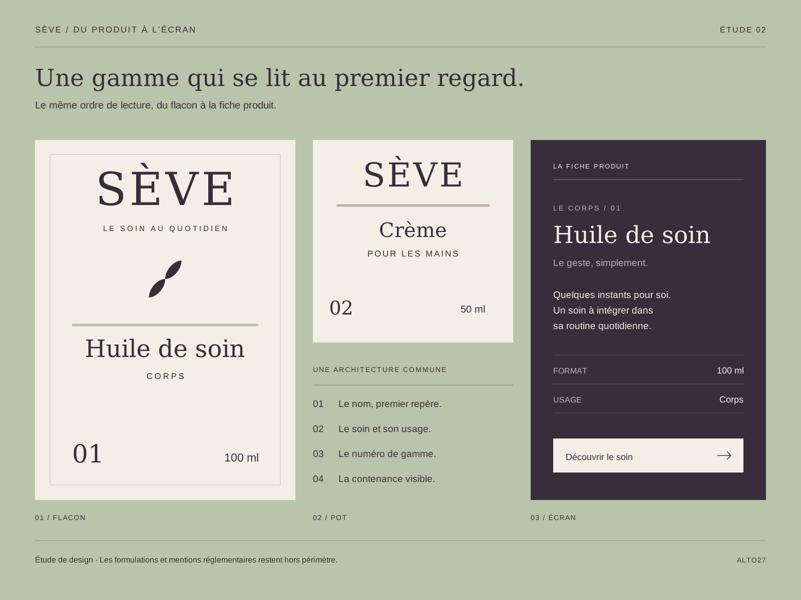
Imagery draws attention; information helps people choose.
Design intentions and study deliverables, without measured commercial results.
A name, wordmark, symbol and four colours brought together in a consistent identity.
Two label formats connected by a shared grid and a clear hierarchy of information.
A product page concept connecting photography, use and practical information.