FOOD & LIFESTYLE / IDENTITY & COMMUNICATIONS
SOLEA.
Sunshine, in every detail.
SOLEA is a bright, joyful restaurant brand concept, combining colour, personality, real food photography and carefully composed editorial materials.
 Photo: Valentin / Unsplash ↗
Exploring a different visual language.
An expressive visual language can still be exacting: consistent colours and typography allow the materials to play with form without losing the identity. No SOLEA restaurant has been created or operated.
Brand identity, editorial design, digital experiences and creative content.
Research, visual system, applications and presentation.
Personal exploration / no client commission.
A distinctive palette.
#E74F20#244BBC#FFCE31#FFF7E7A sunny spirit, never artificial.
SOLEA starts with a simple observation: many food brands pursue visual perfection until spontaneity disappears. This project explores generosity, light and an identity that immediately whets the appetite.
The photographic direction uses real scenes and materials: a terrace table, a sunlit drink, approachable food. The photographs are mood references, not images of an existing restaurant called SOLEA.
Licensed real photographs, credited on the page. Photo: Sergey Kotenev / Unsplash ↗
A signature that shines.
The logo combines editorial lettering with a stylised sun symbol. The palette favours bold colours: vivid orange, cobalt, lemon yellow and ivory. Solid colours and white space create the balance.
The symbol stays secondary to give the name room to breathe. It can appear on labels, stamps, menus and brand icons, following consistent usage rules.
Logo and symbol created as vector SVGs.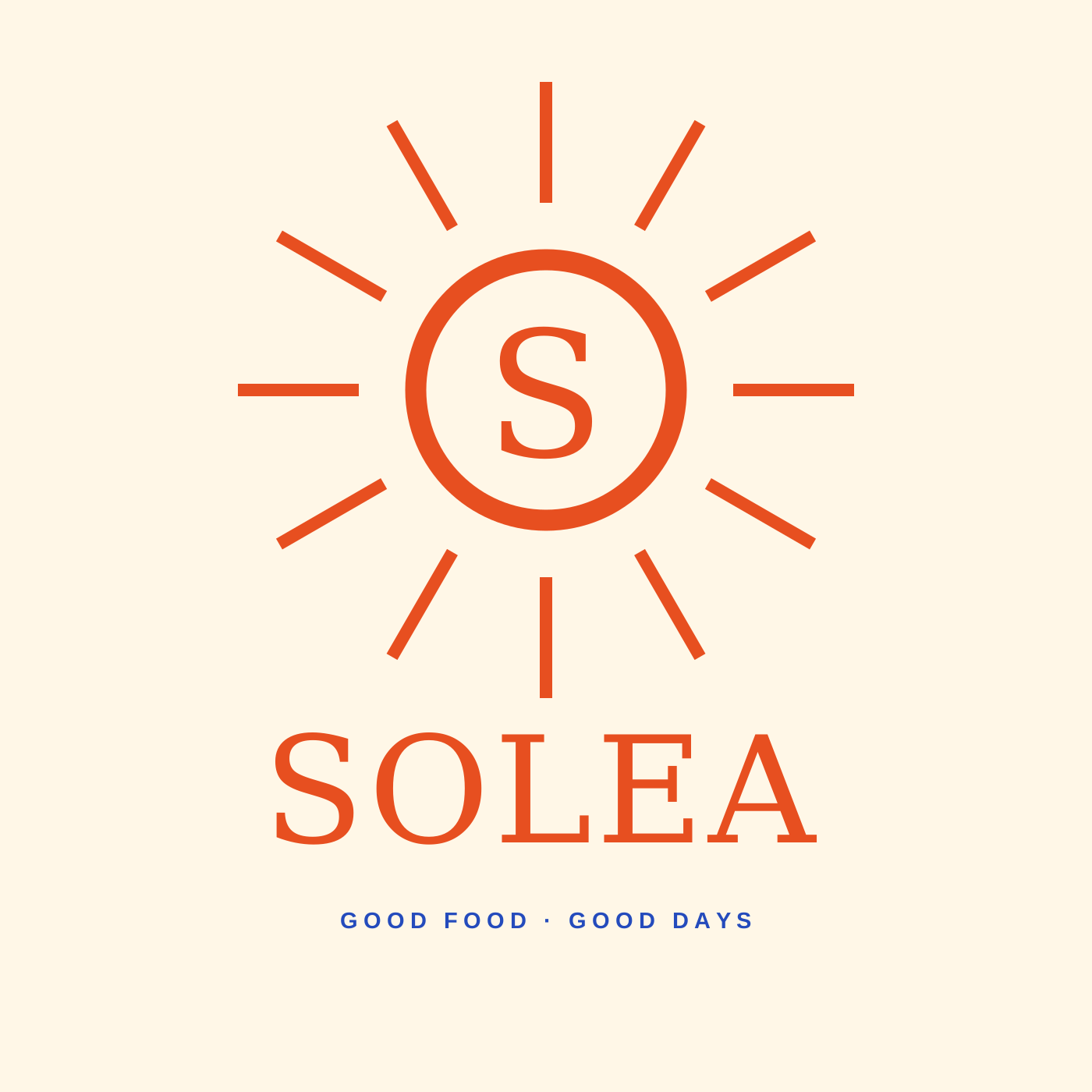
A menu made to be read.
The menu is designed as both a brand expression and a tool for choosing. A small number of sections, clear heading hierarchy and colour draw attention to dish categories rather than every individual line.
The dishes and prices in the mock-up are fictional, used only to test readability and the editorial design’s character. The same grid could be adapted to lunch, dinner or drinks menus.
Vector menu mock-up, 1400 × 1800.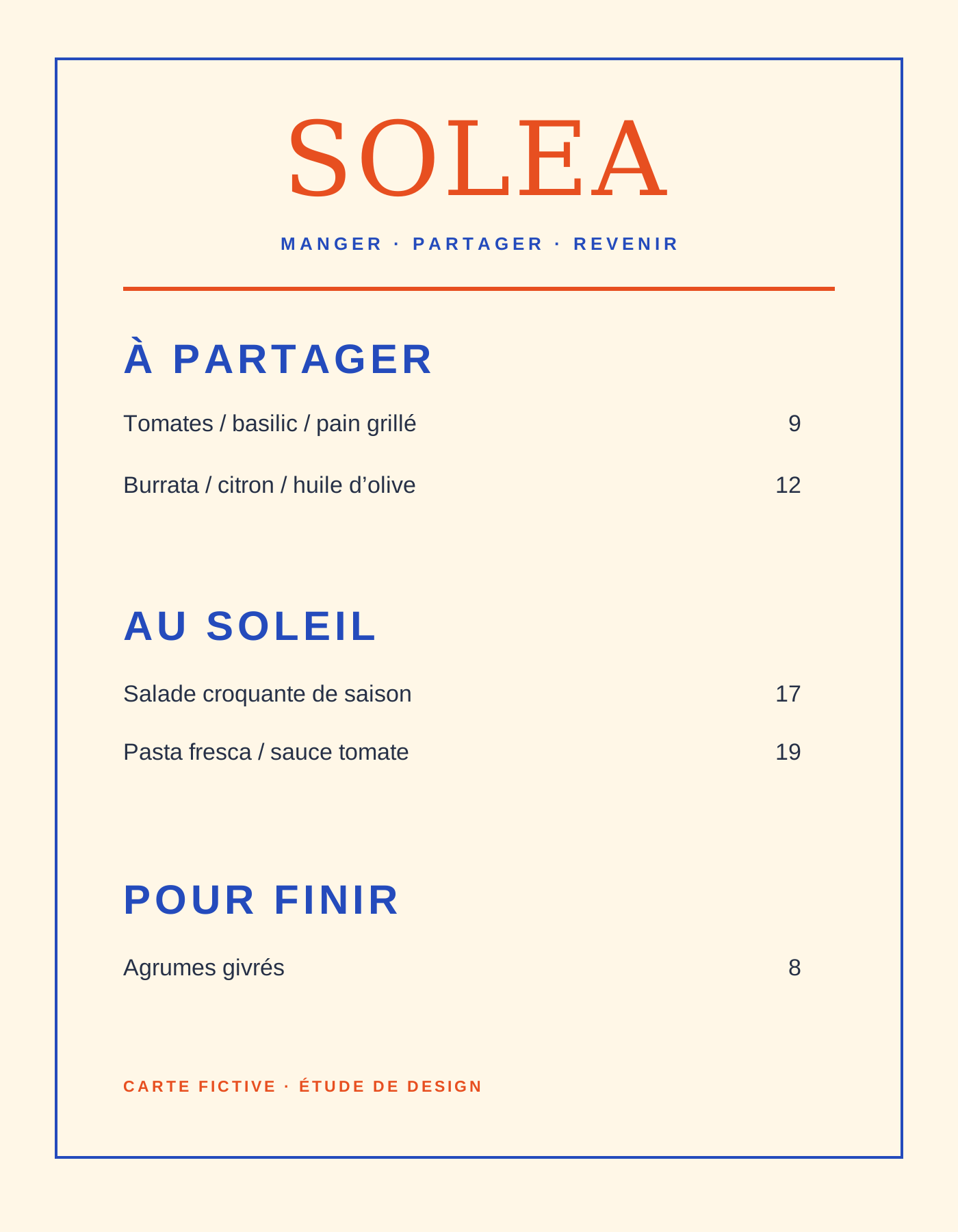
A taste of sunshine on the street.
The posters explore direct communication through short phrases and solid colours. The lemon becomes a geometric motif rather than a decorative photograph.
The aim is a campaign that works from a distance. This visual language can move from a billboard to a story or a small flyer while remaining recognisable.
Imagined posters and variations; no real advertising placements.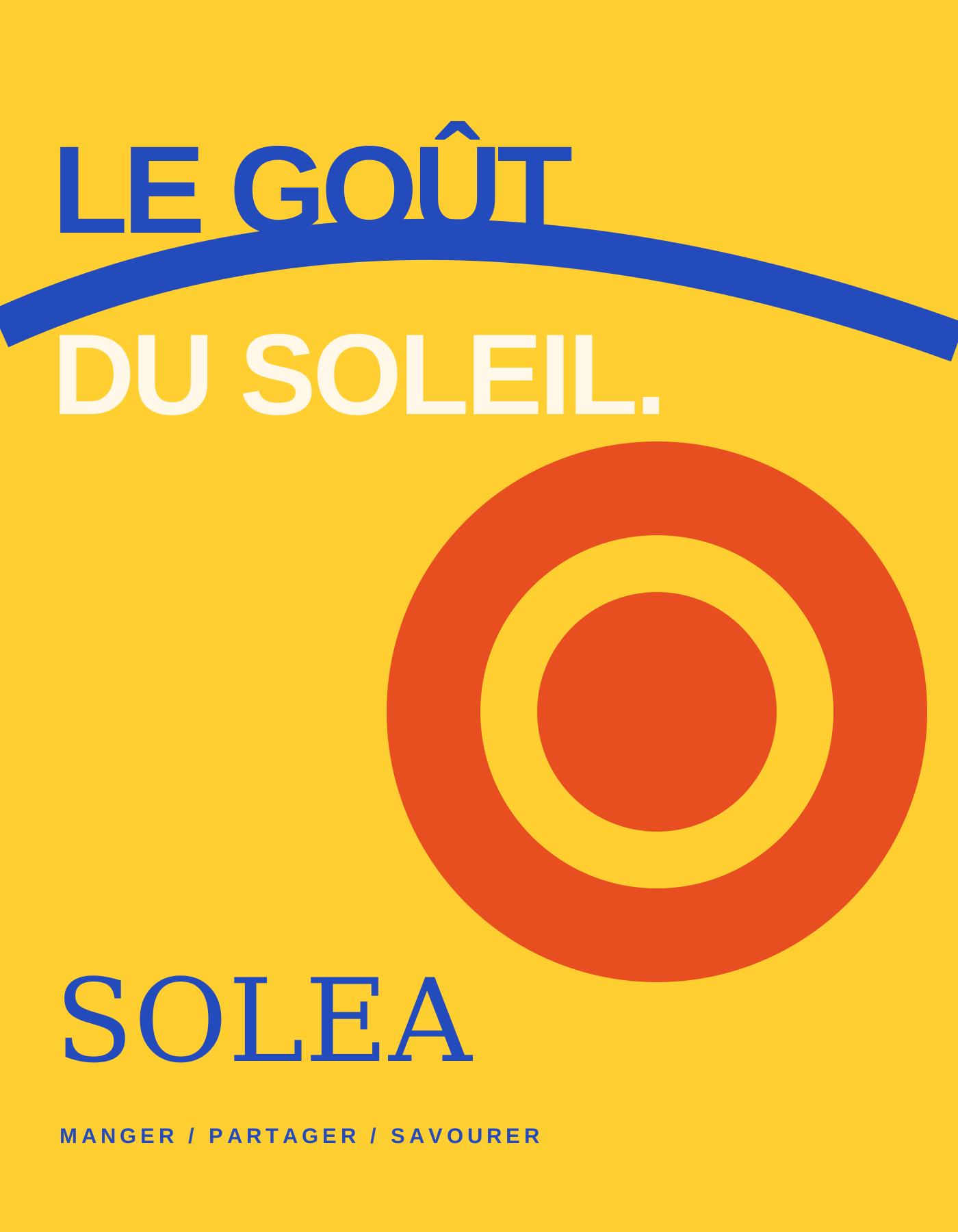
An appetite for discovery.
The proposed website prioritises atmosphere and two actions: browsing the menu and getting in touch. Navigation stays accessible and light, while photography leads the experience.
The mock-up combines licensed real photographs with original graphic design. It is neither a working booking site nor advertising for an existing restaurant.
Web direction prototype, not deployed.DAYS.MANGER, PARTAGER, SAVOURER.
A brand that lives every day.
The fictional social grid alternates table photography, product imagery and graphic messages. The aim is flexible communication without falling into uniformity.
The content can focus on a dish, a shared moment or a one-off announcement. Typography and colour provide consistency rather than a filter applied to every image.
Example story created at 1080 × 1920.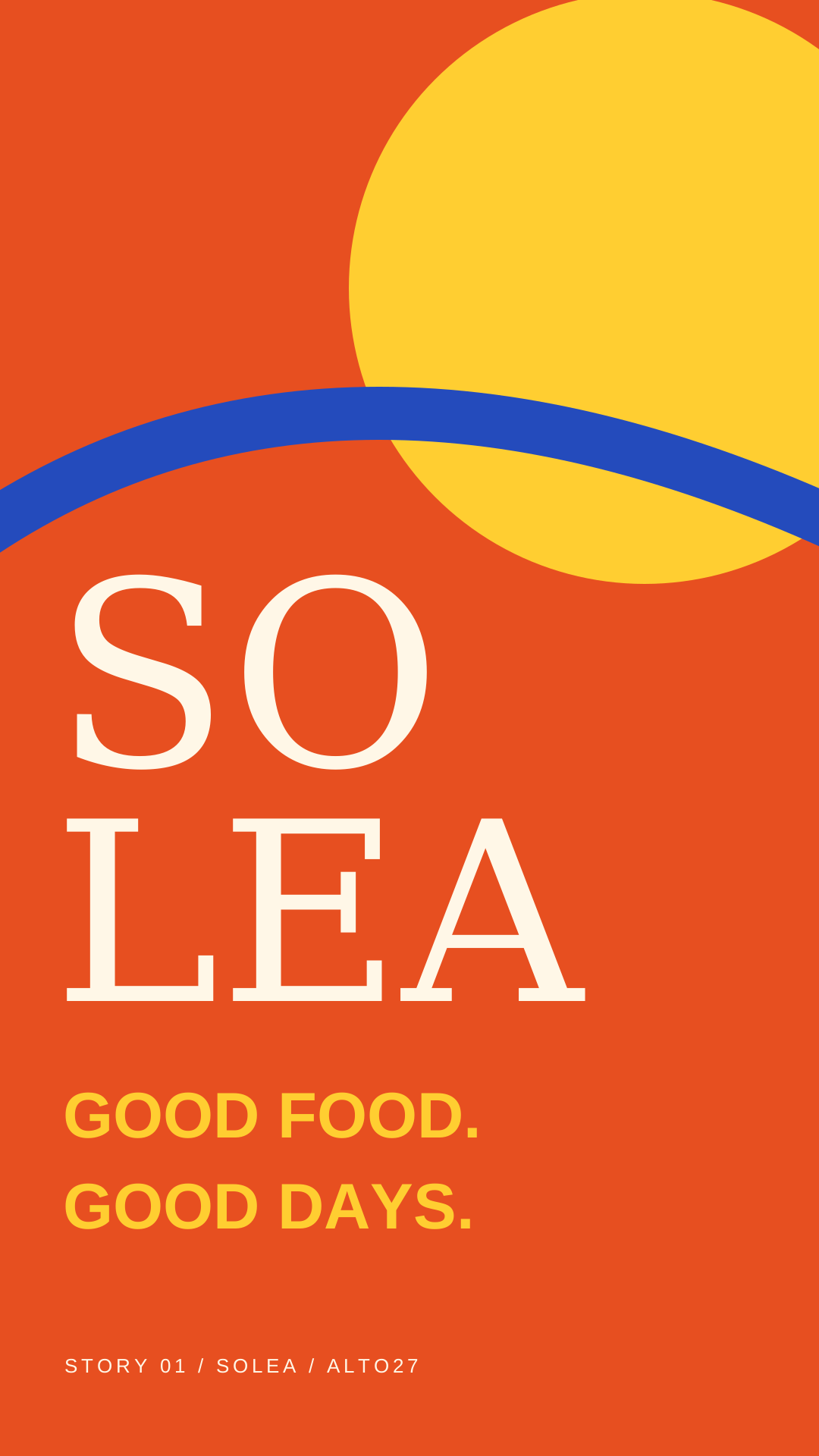
Materials designed together.
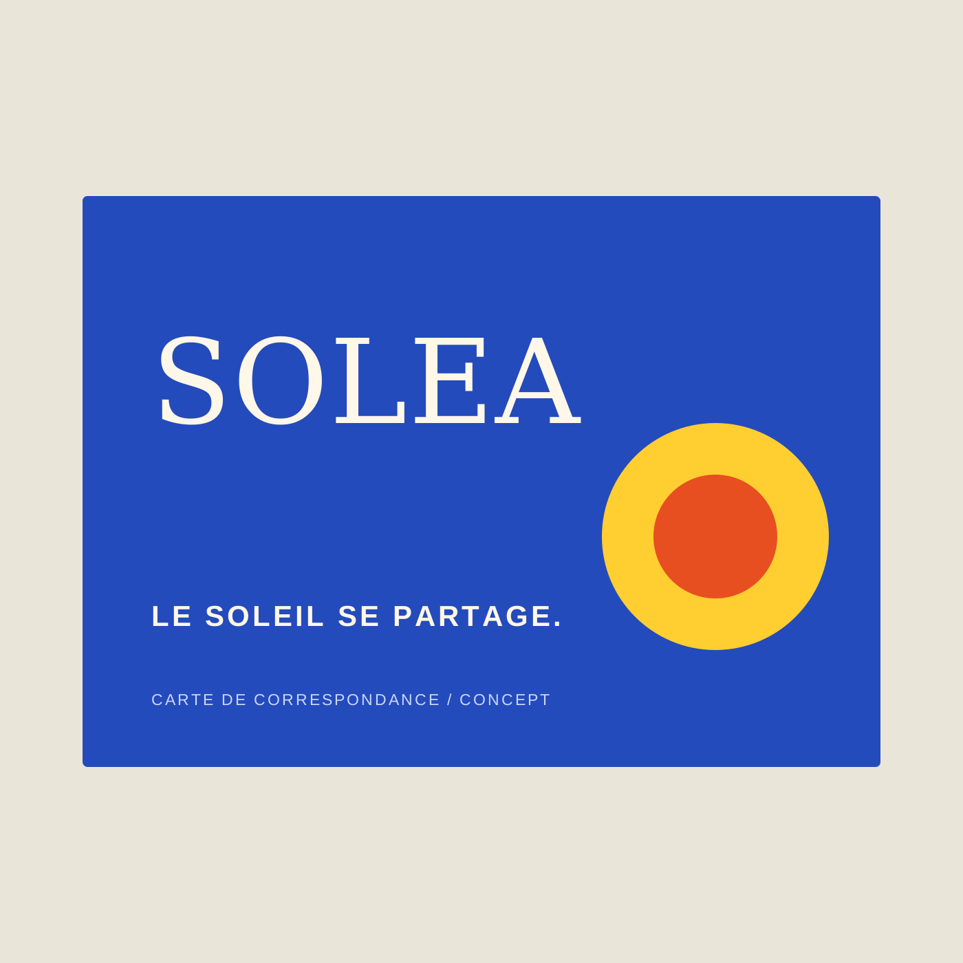
Correspondence card
A printed card that connects service and identity.
 Photo: gabbiistudios / Unsplash ↗
Food atmosphere
Real photograph used as an art-direction reference.
Colour signature
A graphic variation of the sun symbol on an ivory background.
Another way to create.
An expressive visual language can still be exacting: consistent colours and typography allow the materials to play with form without losing the identity. No SOLEA restaurant has been created or operated.