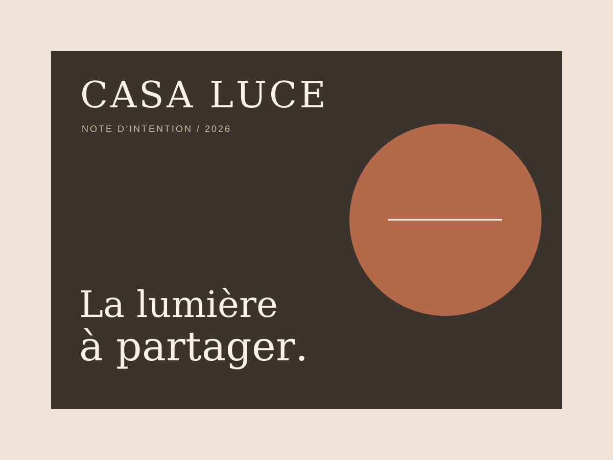
CONCEPT EXPLORATION
Editorial cover
A fictional booklet exploring an extension of the brand.
FOOD / IDENTITY & EXPERIENCE
Imagining a distinctive Mediterranean restaurant, where the identity begins before guests sit down: in the typography, the words, the menu, the light and the materials.

A warm yet restrained identity: editorial typography, a seasonal menu and welcome materials designed as objects in their own right. The challenge is to create a system that works across very different formats without losing its character.
Food · identity & experience.
Brand guidelines, print materials, website concept and editorial content.
An independent design exploration, with no real client and no published campaign.
#f8f1e7#b4694a#67705c#3a342dThe Casa Luce concept draws on the pleasure of lingering at the table, mineral textures and late-afternoon light. Rather than a postcard vision of Italy, it builds an atmosphere through believable details: tableware, paper, shadows and the grain of wood.
The photographic exploration uses real restaurants and dining scenes. These are independent references, not photographs of the fictional restaurant. They guide the framing, colour treatment and rhythm of the brand’s communication.
A warm photographic direction, informed by observing a real place.The wordmark pairs serif capitals with a deliberately airy composition. A terracotta circle suggests the sun without literal illustration or decorative excess. The result remains recognisable on a menu, a business card or a sign.
Each of the four colours has a clear role: ivory for breathing space, ink for readability, terracotta for recognition and olive for details. The designs in this series are supplied as vector SVGs to remain crisp at any size.
Wordmark, emblem and typographic system.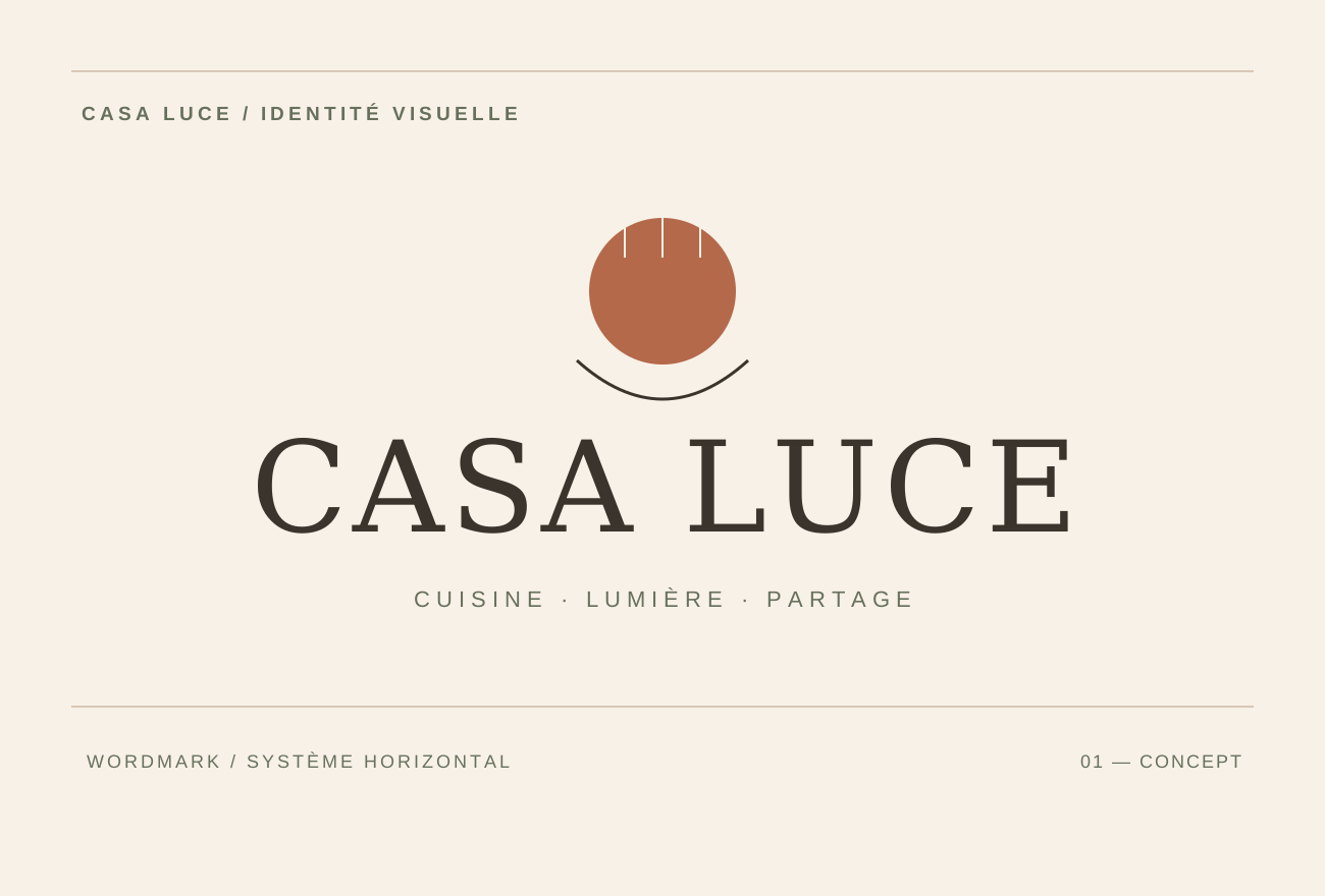
The menu is designed as an editorial piece rather than a price list. Its French section titles, “Pour commencer”, “À table” and “Le dernier mot”, create a natural reading flow. Generous spacing keeps it comfortable to read, even in the light of a terrace.
The dishes and prices are examples written to test the layout; they do not represent any existing commercial offer. The SVG remains editable for a real menu, allergen information or a translation.
Fictional menu: dishes, prices, hierarchy and space.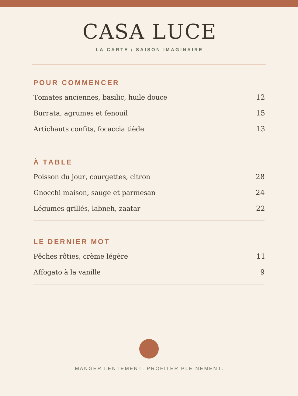
The business cards explore the contrast between ivory paper and a solid terracotta colour. The front establishes the identity, while the reverse leaves generous room for the message. Overlapping elements suggest material and finish without using a generated image.
This design could be adapted into a thank-you card, a place card or correspondence stationery. The composition uses realistic formats that a printer could produce once dimensions and technical requirements have been confirmed.
Ivory card, terracotta reverse and wordmark application.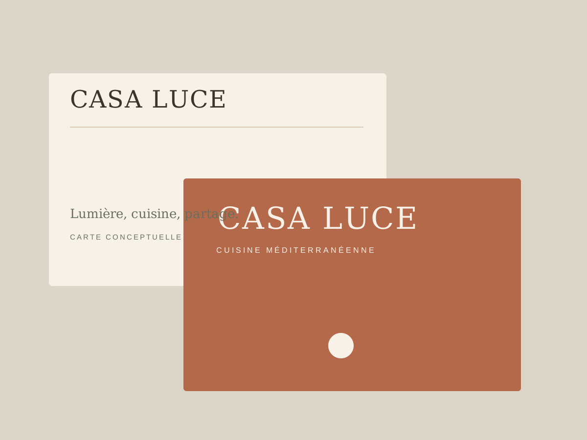
The website concept first conveys the experience, then makes the offer easy to understand. Concise navigation, immersive photography and a clear route to booking form the structure of the proposed homepage.
The prototype shown here is built directly in HTML/CSS, with selectable text. It is not a live booking service: no tables, availability or customer data are recorded.
Brochure website prototype: image, navigation, message and action.Une table, une conversation, la douceur du jour.
DÉCOUVRIR LE CONCEPT ↗
A confirmation card carries the brand’s tone into the next interaction. Its calm layout avoids the usual administrative feel: the heading, open space and single line of information create continuity with the imagined dining experience.
The card is a graphic example. No customers, reservation dates or physical addresses have been invented. In a real implementation, it would draw on information from the restaurant’s chosen booking system.
Confirmation message and correspondence mock-up.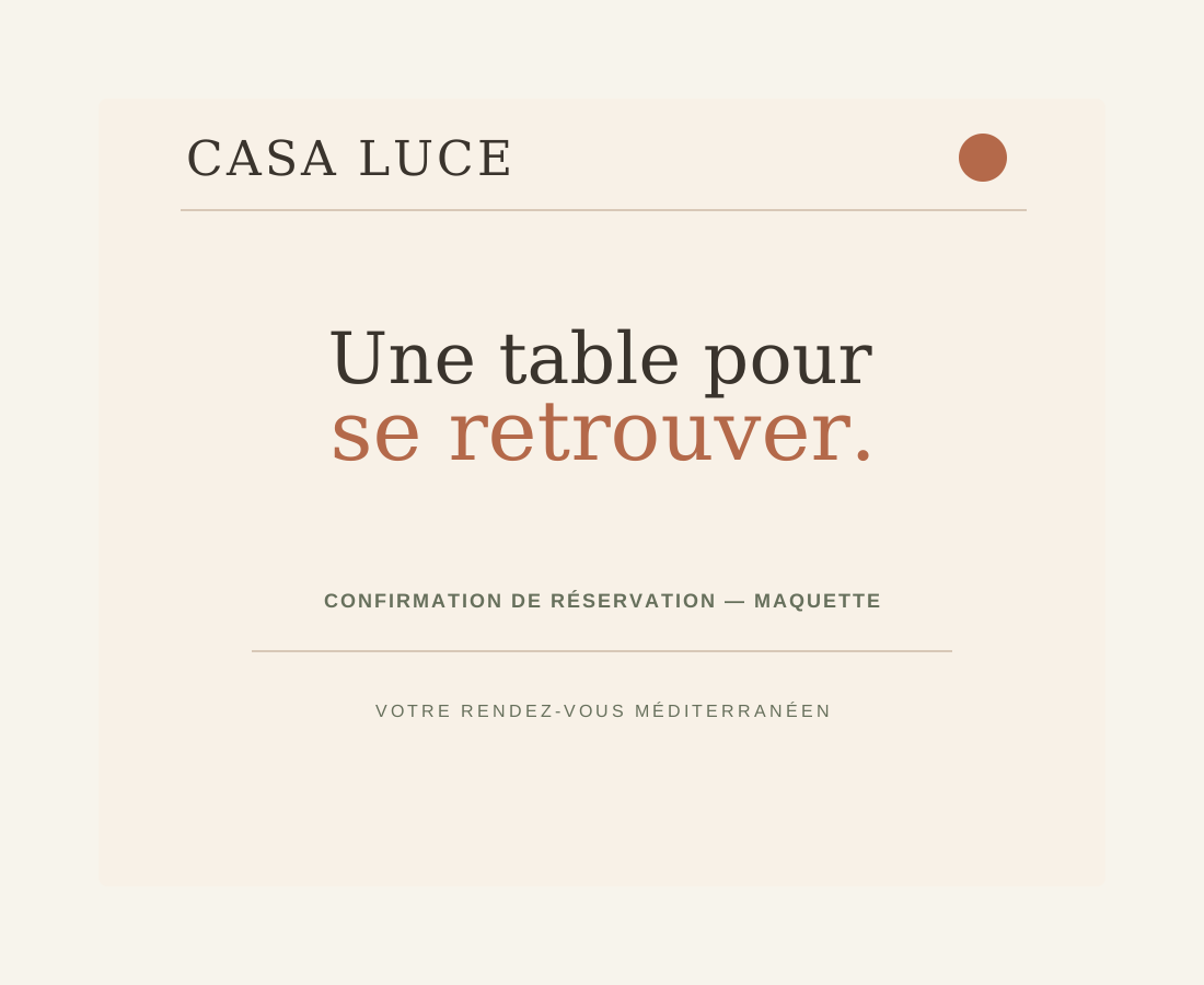
The packaging follows the same graphic discipline as the menu. An off-white background gives the wordmark room to breathe, while terracotta adds a visible accent. The packaging becomes a signature rather than an overcrowded advertising surface.
These forms are vector design simulations, with no physical production. They test logo placement, contrast and possible variations before any production study.
Packaging exploration: takeaway bag and container.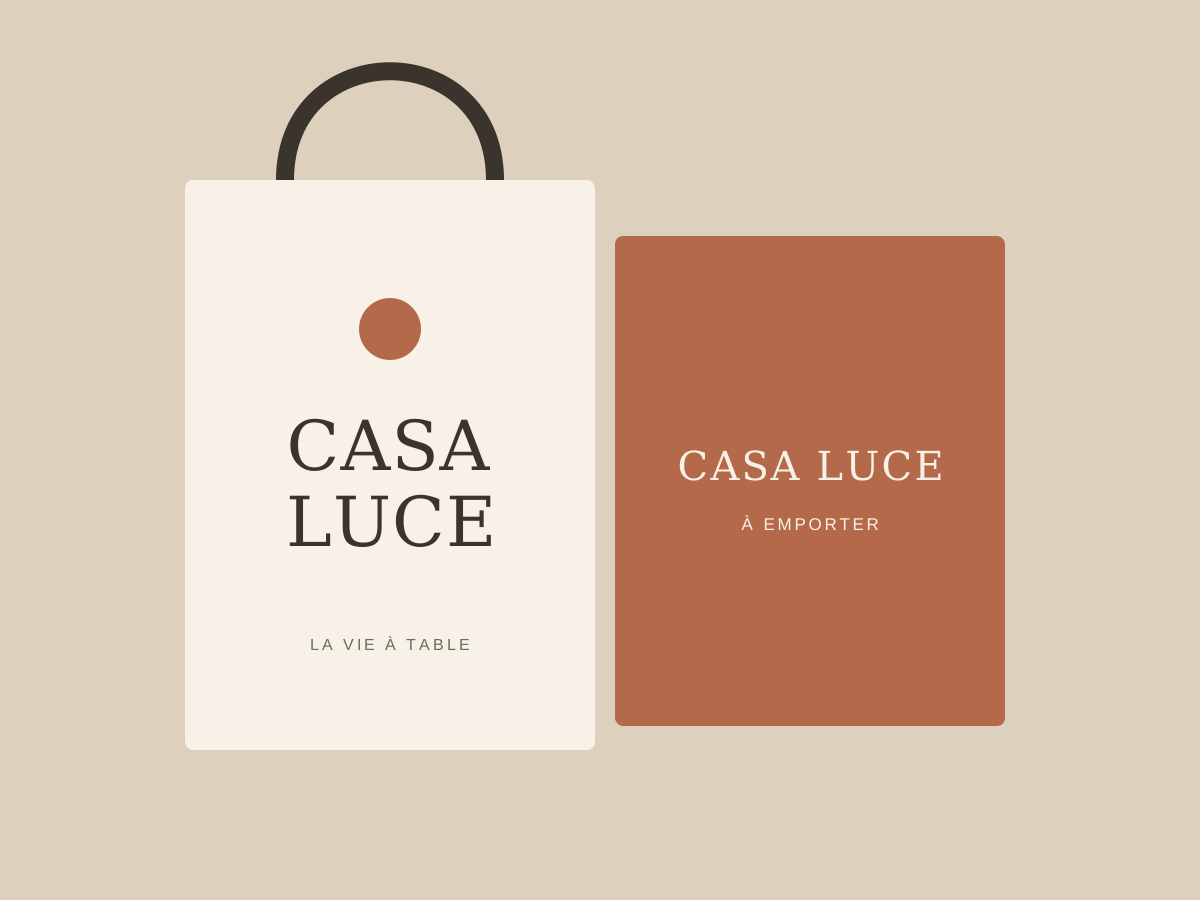
A story built around the French line “Une table. Une lumière.” shows how the brand could communicate with a few simple elements. Solid colours and words take over from photography while staying within the same visual world.
The series also includes a small editorial piece that could become a brochure or recipe booklet. Nothing has been published for this fictional brand; these are design proposals.
Vertical story and editorial signature.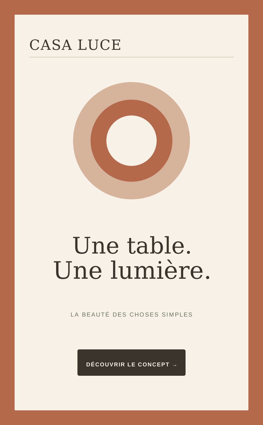
A fictional booklet exploring an extension of the brand.

A documentary view of Mediterranean dining.
A wordmark variation for use across materials.
This study presents an art direction imagined for Casa Luce. The materials are original prototypes; no client relationship, published campaign or commercial performance is claimed.