CONCEPT EXPLORATION
Concept screen
Exploration of a website composition in vector format.
ARCHITECTURE / IDENTITY & DIGITAL
Creating the visual world of an imagined architecture studio without the usual construction clichés: bringing out volumes, light and a precise approach.

A precise graphic language applied to stationery, presentation documents and the digital experience. The challenge is to build a system that works across very different formats without losing its character.
Architecture · identity & digital.
Brand guidelines, print materials, website concept and editorial content.
An independent design exploration, with no real client and no published campaign.
#f3f1ec#1e201e#777d70#d1d0c7Forma Studio starts from a fundamental contrast: the mass of concrete and the space it frames. The photographic compositions focus on geometry, openings and cast shadows to reveal a sensitive approach to architecture rather than a collection of surfaces.
The buildings in the photographs are real, but they are not projects by the fictional studio. The images serve only as references for the art direction and the development of a visual vocabulary.
A real architectural perspective used as a framing reference.FORMA is set in widely spaced capitals. A simple geometric symbol complements the wordmark and can stand alone at small sizes. The palette focuses on ink, stone and muted sage.
Rather than adding ornament, the system relies on a stable grid. This logic can extend to web pages, proposal documents, site signage or a project catalogue.
Wordmark and geometric monogram.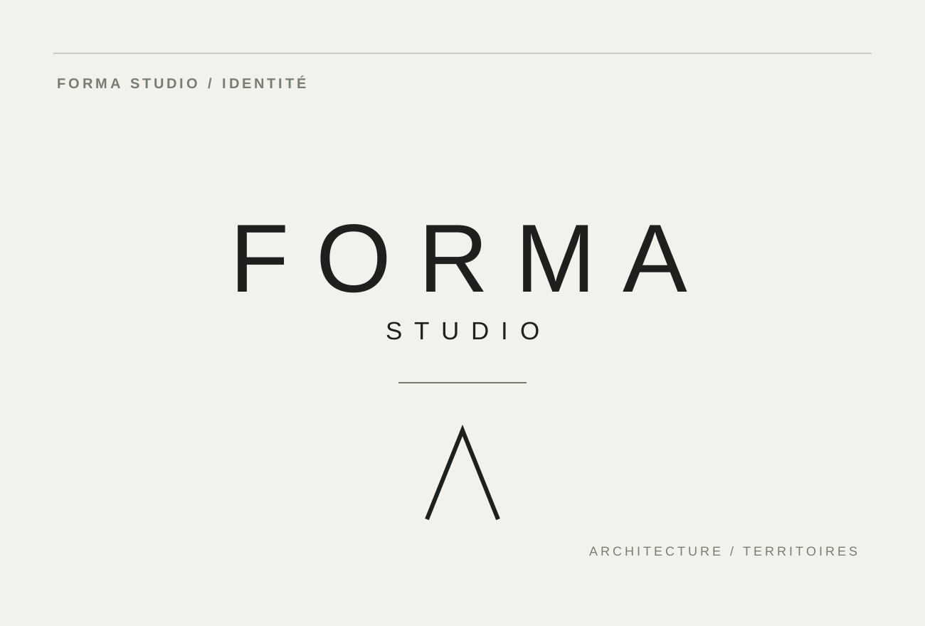
The stationery contrasts off-white and graphite surfaces. This helps establish a clear hierarchy between the brand signature, the contact’s identity and contact details when these become available.
The cards contain no invented names or addresses; they only test the visual language. Actual printing would require decisions about paper, safety margins and any finishing treatments.
Stationery, front-and-back compositions and finish explorations.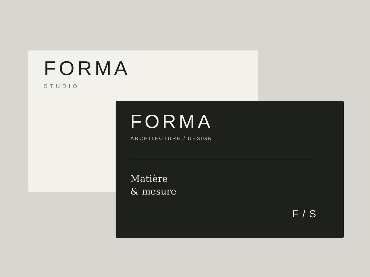
The concept presentation borrows from the language of architecture: grids, lines and generous margins. The cover is deliberately composed like a working document, with imagery that raises a question rather than making a commercial promise.
A real architecture presentation would need plans, captions, floor areas, credits and permissions. The illustrations here are graphic studies; no construction projects are attributed to the fictional business.
Presentation cover with a structured graphic layout.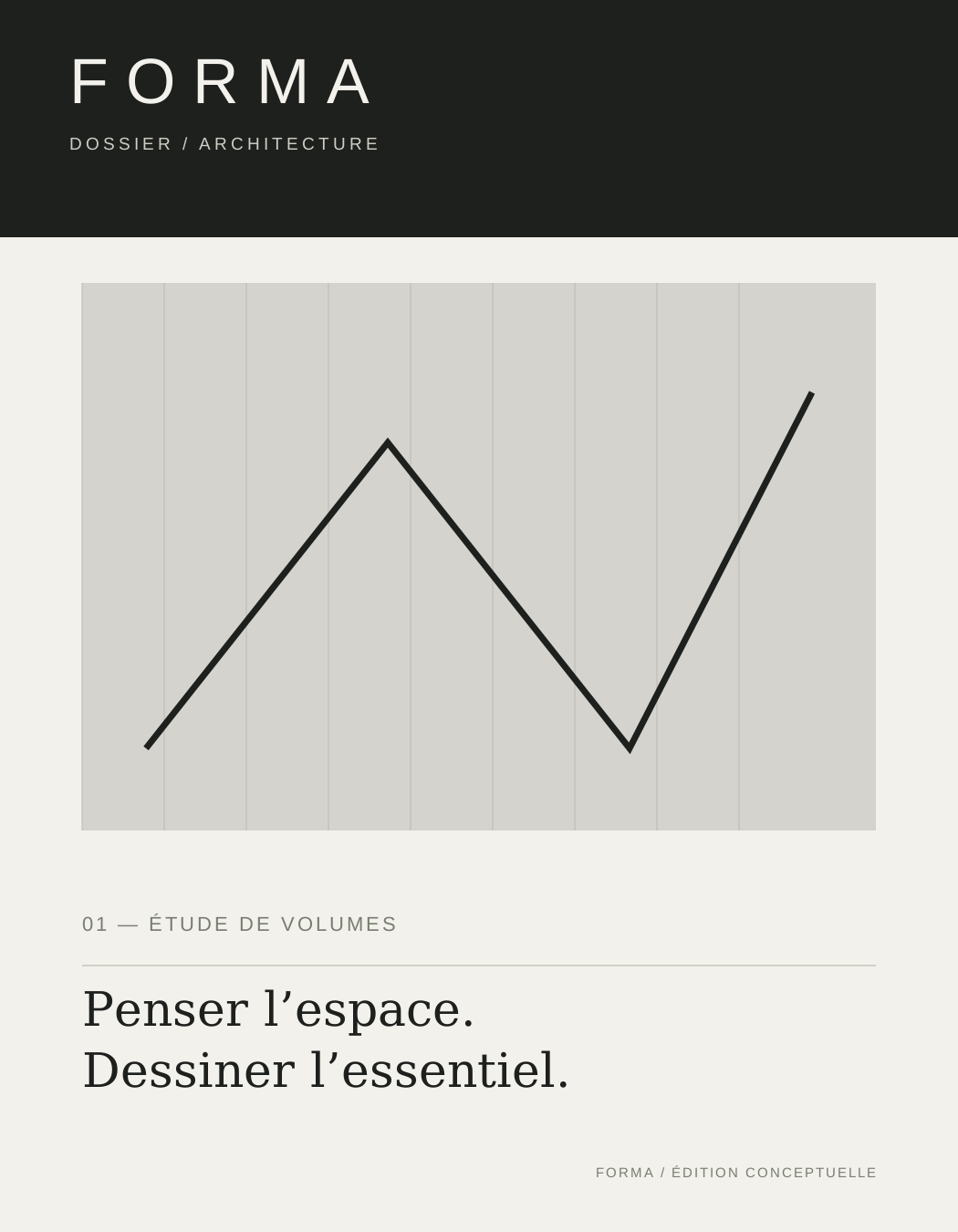
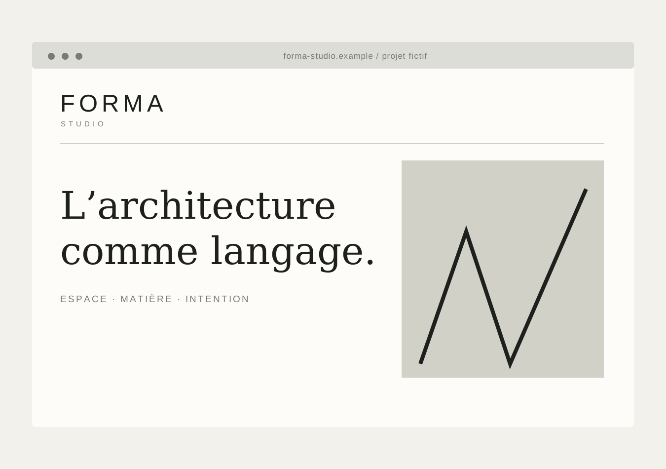
The website proposal balances text and photography. Visitors can understand the approach, browse references and contact the studio without constant animation. Typography sets the reading pace.
The mock-up is an HTML/CSS prototype with no connection to a catalogue of real projects. It demonstrates a navigation principle and content direction that could be adapted for an actual practice.
Responsive, editorial homepage prototype.Pour les espaces de demain, avec justesse et mesure.
EXPLORER LE CONCEPT ↗
On large-format materials, the identity uses simple contrasts and a strict hierarchy. A construction-site frontage is imagined as a clear communication surface, without invented information about companies or building work.
The proportions are exploratory: the SVG is a composition study, not a manufacturing drawing. The system still uses a sense of scale to assess readability and impact.
Concept for a construction-site sign, not installed.
An architecture studio’s social channels can tell stories through materials, perspectives and details rather than repeatedly showing building renders. This concept post uses the same typography and geometry as the rest of the identity.
The aim is a recognisable visual presence. No Forma Studio social account is associated with this study, and no performance results are claimed.
Vertical social design built from vector shapes.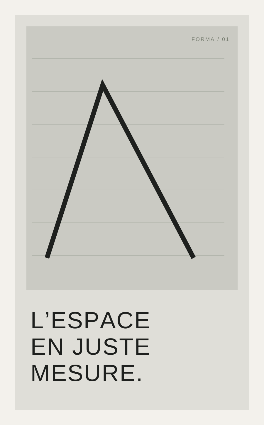
A presentation note sets out the fictional studio’s approach through words and a controlled composition. Clarity becomes a brand choice: generous margins, a steady rhythm and copy concise enough to read.
This document could form the basis of a brochure, a proposal or a Studio page once a real business’s information has been added.
Editorial document: positioning and typographic hierarchy.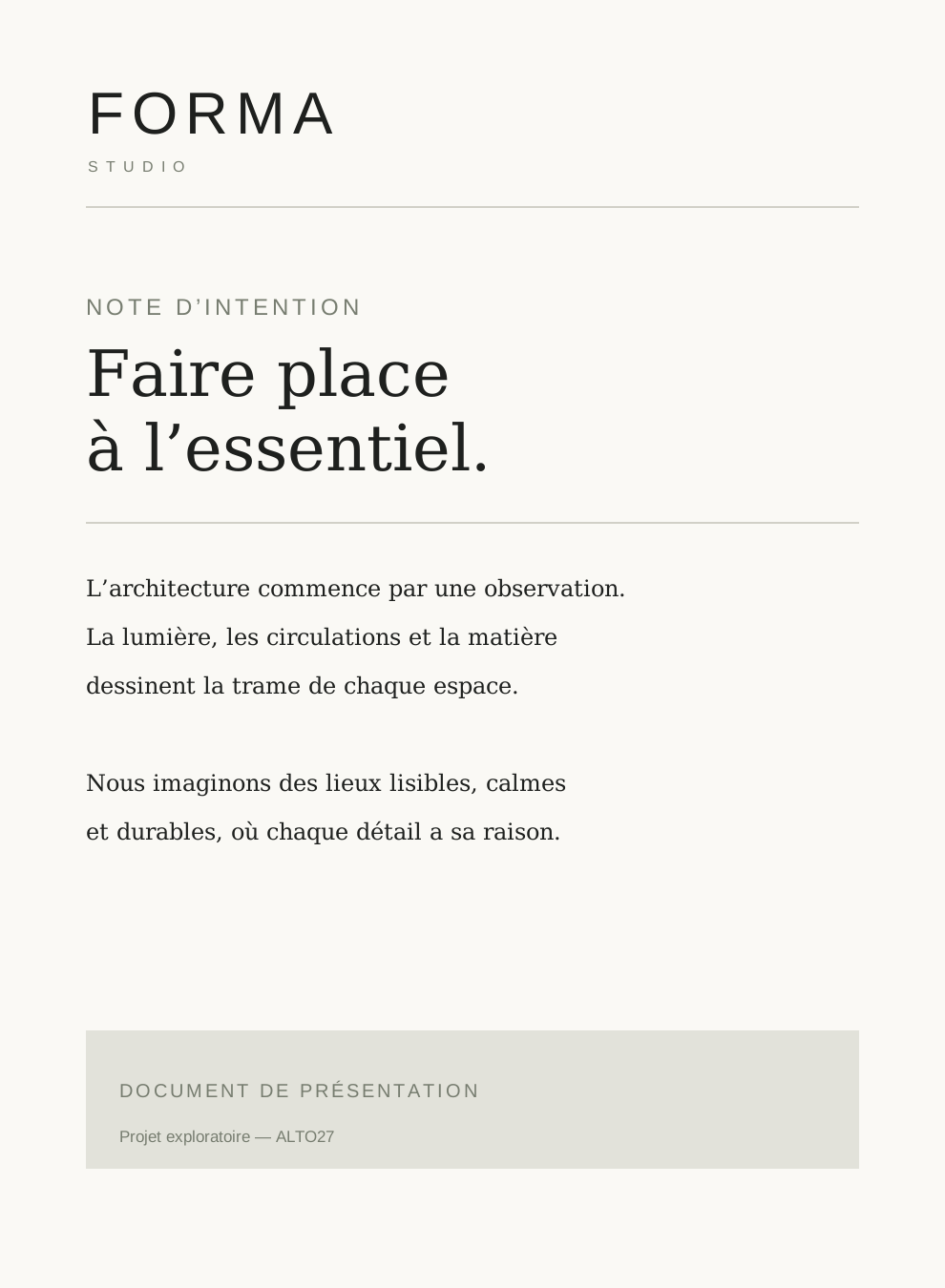
Exploration of a website composition in vector format.

A real façade photograph, credited and not attributed to the studio.
A presentation of the brand positioning.
This study presents an art direction imagined for Forma Studio. The materials are original prototypes; no client relationship, published campaign or commercial performance is claimed.